Around the Corner
Around the Corner
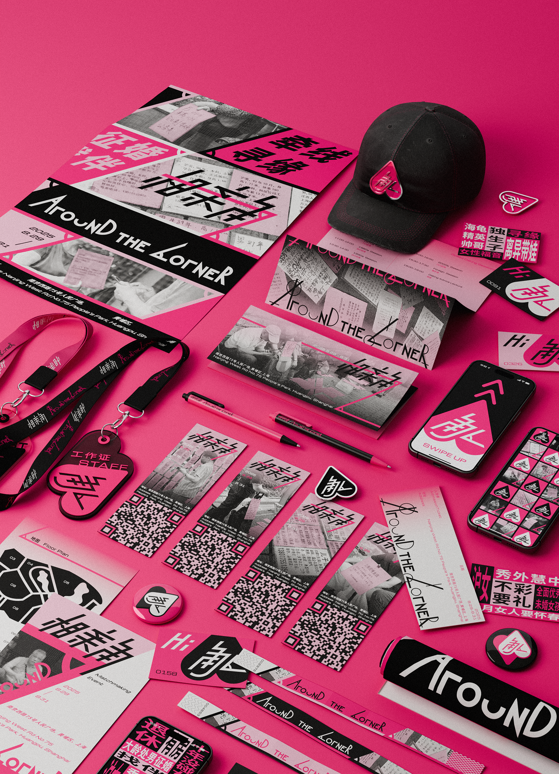
Matchmaking Corner is a place in China where parents of unmarried adults seek potential partners for their children, using criteria such as family background, jobs, and wealth. All the information is condensed into a single A4 sheet without images.
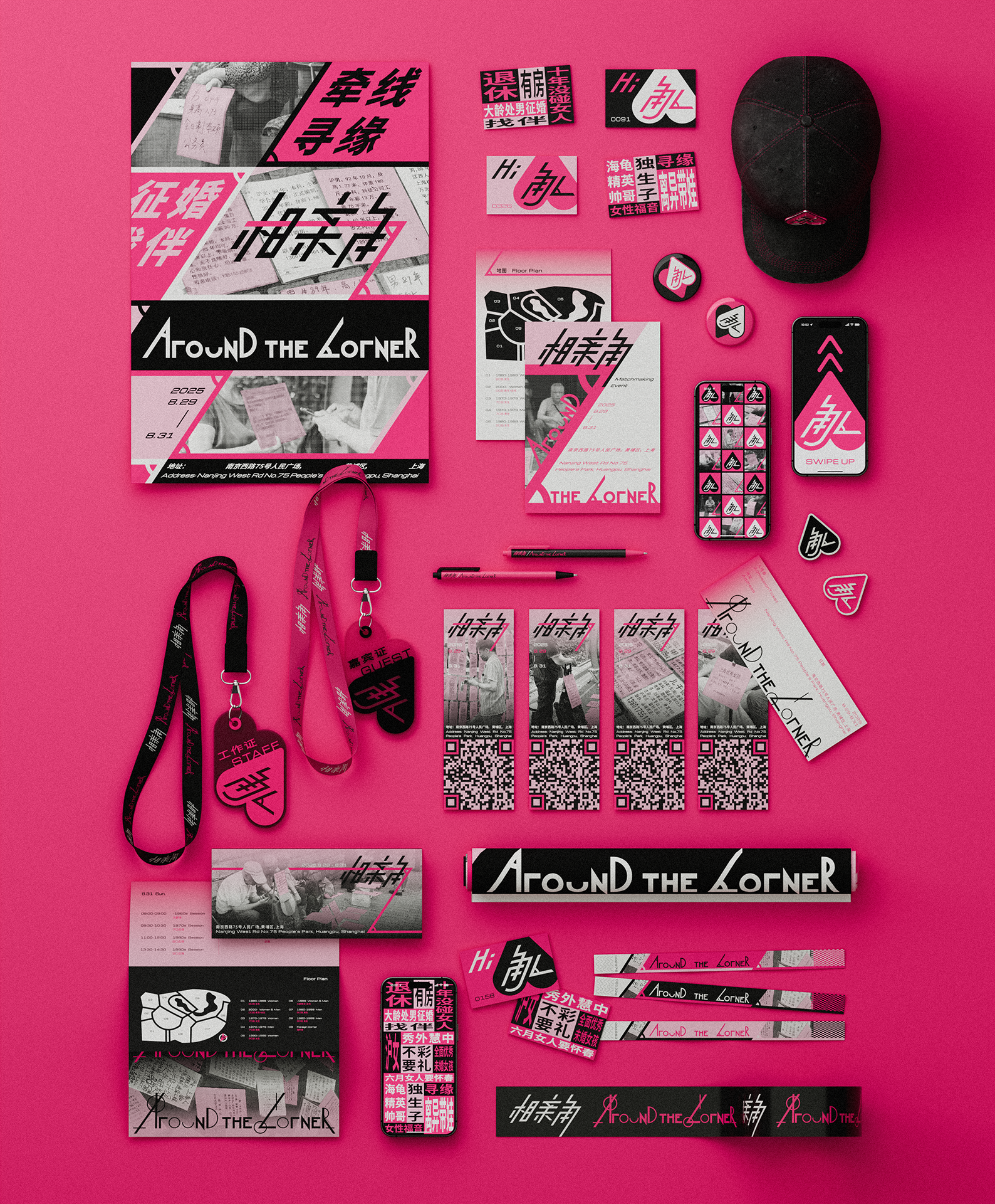
Inspired by this phenomenon, I created a visual identity design package to reimagine it as a commercial event, including name cards, event badges, an app, a brochure, and merchandise. I played on the concept of “love is around the corner.” For the logo, I combined the Chinese character for “corner” with the angle symbol, which also represents the letter “A” for “Around the Corner.”
The visual identity package includes name cards and an app for accessing information more efficiently, event badges to distinguish guests from staff, brochures to assist with navigation, and merchandise to better promote the event.

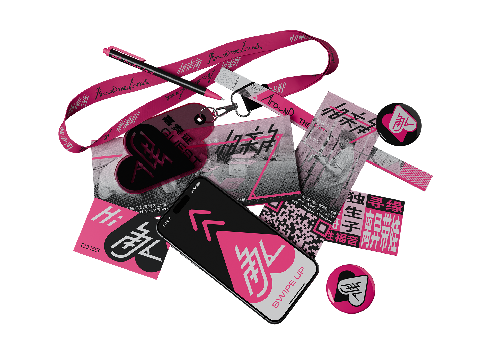
By packaging this activity in more contemporary commercial language, I want to question why matchmaking corners have remained in this raw form which resists digitalization in today’s society. It demonstrates a different form of superficiality from online dating apps, where individuals are reduced to information on an A4 paper, yet avoiding one key element of dating apps' superficiality: appearance. Through this work, I seek to illustrate what happens when these blind dates are digitalized, or when people’s pictures are removed from dating apps.